

Verizon Cloud
6-12 months
2016-2019
Sketch, Invision, Abstract, Maze
a new recents experience and brand 3.0 refresh for verizon cloud's consumer backup product.
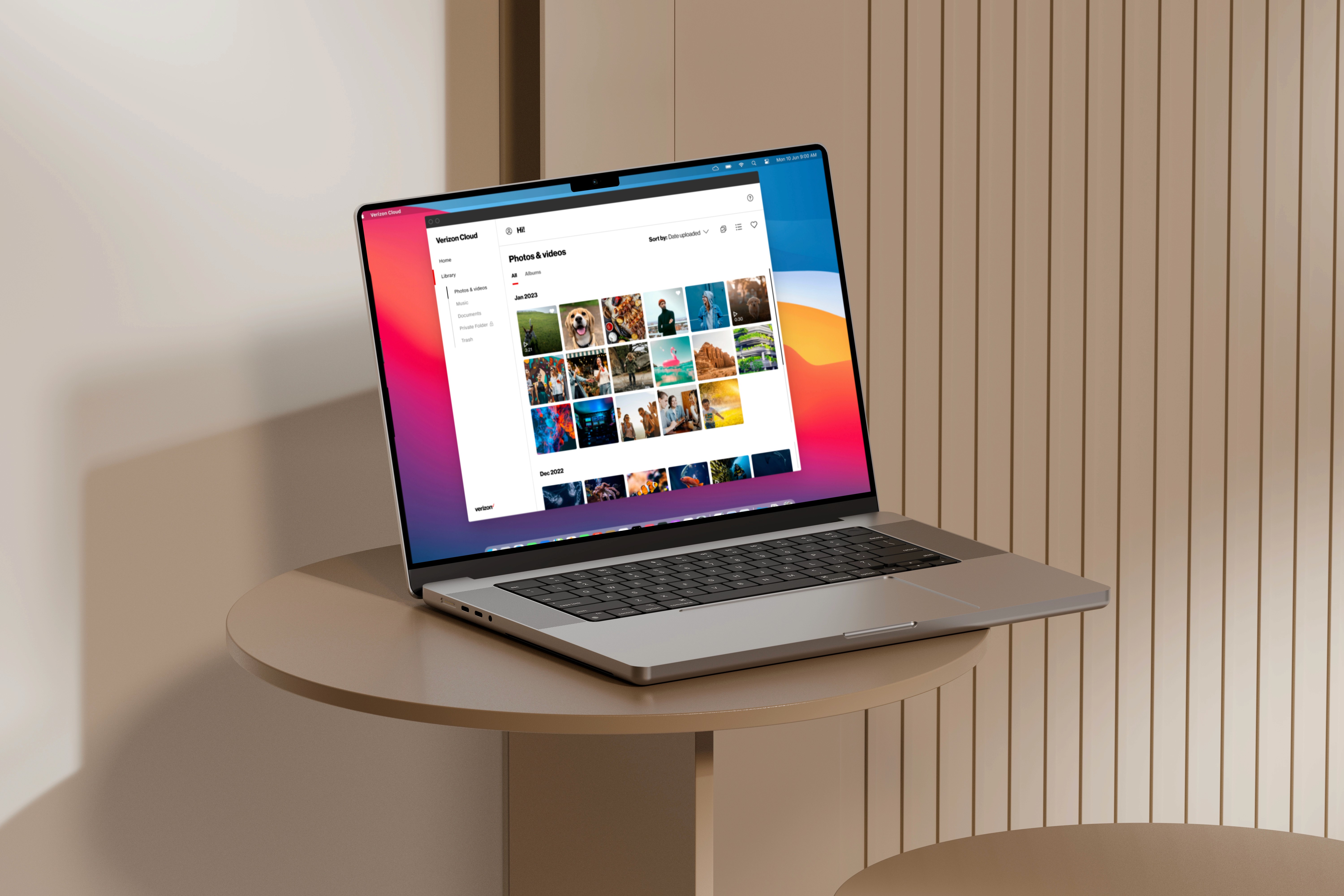
verizon cloud lets users back up files across devices, but finding what they just uploaded wasn't intuitive. the home section displayed only the last eight items, forcing users to dig through folders or navigate to separate sections to retrieve recent content. a backup tool people couldn't quickly access wasn't doing its job.
a dedicated recents experience that surfaced the latest backed-up files where users expected to find them. standardized menu options and filters across the product for consistent navigation. a brand 3.0 ui refresh underneath it all, bringing the consumer cloud experience into visual parity with the rest of verizon's modern product surface.
Tour Guide & Notifications
To ensure effortless navigation, I added a tour guide and tooltips to guide users through the new UI, enhancing the first-time experience. For notifications, I documented a matrix of previous notifications, redefined them as primary and secondary, and designed a system to display one at a time, preventing overload.
Design Guideline
To ensure consistency across platforms, we established a unified design system documenting fonts, colors, iconography, and spacing in a comprehensive style guide. Figma bridged the gap between design and development.
The Outcome
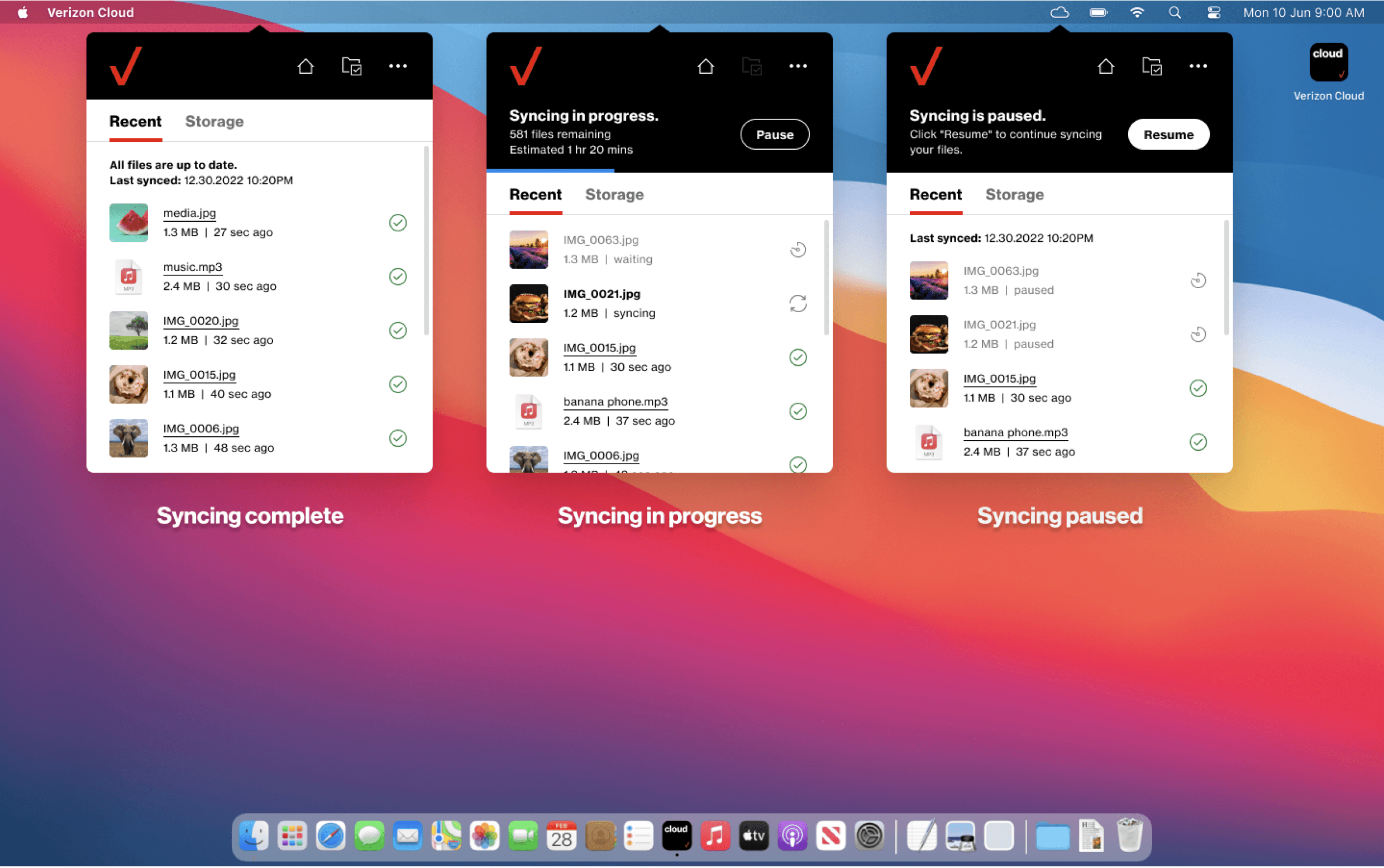
The redesigned Verizon Cloud toolbar led to a more intuitive and engaging user experience. Key improvements included real-time backup status, accessible storage information, and seamless desktop app integration. The addition of a guided tour, contextual tooltips, and a streamlined notification system helped users navigate the interface with ease. Through close collaboration across teams and iterative design sprints, we delivered a cohesive solution that aligned with user needs and enhanced the overall platform experience.