

Ford
12 months
2020–2021
Figma, Sketch, Tableau, Miro
designing telematics dashboards that turn fleet data into decisions, and cut reporting time by more than half.

fleet operators were drowning in telematics data and starving for insight. dashboards built for engineers exposed every metric without prioritizing the ones that mattered, leaving fleet managers to write their own reports out of raw data exports. real-time monitoring was technically possible and practically unusable.
data-intensive dashboards designed for the people who actually needed to act on the numbers, not the people who generated them. predictive analytics features built in collaboration with engineering, surfaced through interfaces that respected the operator's mental model. reporting time dropped 60%. task completion lifted 45%. the data didn't change; the relationship to it did.
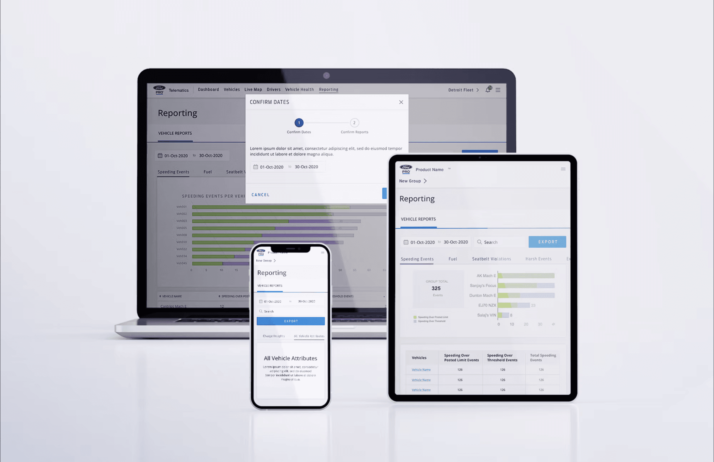
What does design owe people who spend their workday inside the tool?
Fleet managers don't visit Ford Telematics. They live in it. The dashboard is where reports get generated, vehicle health is monitored, drivers are tracked, and decisions about routing, maintenance, and compliance happen every day. When the IA of a tool like that is disjointed, the cost isn't just annoyance. It's cognitive load that compounds over a workday and erodes the ability to do the actual job.
The role was UX Lead, brought in to audit the information architecture and redesign the larger structural parts of the Telematics experience. The work spanned four user archetypes — fleet managers, drivers, dispatchers, and administrators — each with different relationships to the same data, and each needing the tool to show up differently. The starting brief was an IA audit; what emerged was a structural rethinking of how the platform organized itself around the work people actually did.
Research surfaced four problem areas the team kept circling back to. Finding information, where the existing navigation and flow forced users through disjointed paths to get to the same data. Completing tasks, where the most common fleet manager activities required more steps than they should have. Managing fleets, where the tools that should have surfaced the right insight at the right moment were buried behind layers of navigation. Getting support, where the knowledge needed to use the platform effectively was scattered across documentation, internal teams, and tribal expertise.
The reframing came from a working principle that shaped the rest of the engagement: reporting in a daily-use tool isn't a transaction, it's a relationship. Users return to the same screens hundreds of times a year. Every cognitive cost compounds. Every unnecessary step gets paid in repetition. The redesign treated the platform as a relationship to maintain, not a destination to ship.
What shipped reorganized the experience around how fleet managers actually worked. An interaction history and documents hub gave users a single place to retrace their steps. Context-aware capabilities surfaced relevant tools based on what users were doing rather than where they navigated. A centralized profile captured contextual and behavioral signals to make the experience progressively more personalized over time. Contextual support, tips, and insights replaced the previous pattern of users having to know what they didn't know. And underneath all of it, the structural move that made the rest work: a modular architecture that broke standalone experiences into reusable components, so the platform could evolve without requiring a new redesign every quarter.
Reporting time dropped 60%. Task completion lifted 45%. The data didn't change. The relationship to it did.
Three takeaways shaped the work and travel with me into the next engagement like this:
Reporting is a relationship, not a transaction. When users spend their workday inside the tool, every cognitive cost compounds. The right unit of analysis isn't the screen — it's the year of repeated use.
Information architecture is the most underrated design work. IA decisions made early determine what every later design decision is allowed to do. Most teams treat IA as setup; senior design work treats it as the foundation everything else stands on.
Modular architecture solves more problems than it looks like it should. Breaking standalone experiences into reusable, self-contained components meant the platform could keep evolving without forcing a redesign every time the requirements shifted. The same principle came back four years later in the Verizon BYOD work. Some design lessons travel further than the projects that taught them.