

Pru
12 months
2021–2022
Figma, Sketch, Zeplin, Storybook
redesigning a $44 billion business platform and shipping the design system that sucessfully got adopted across eight teams.
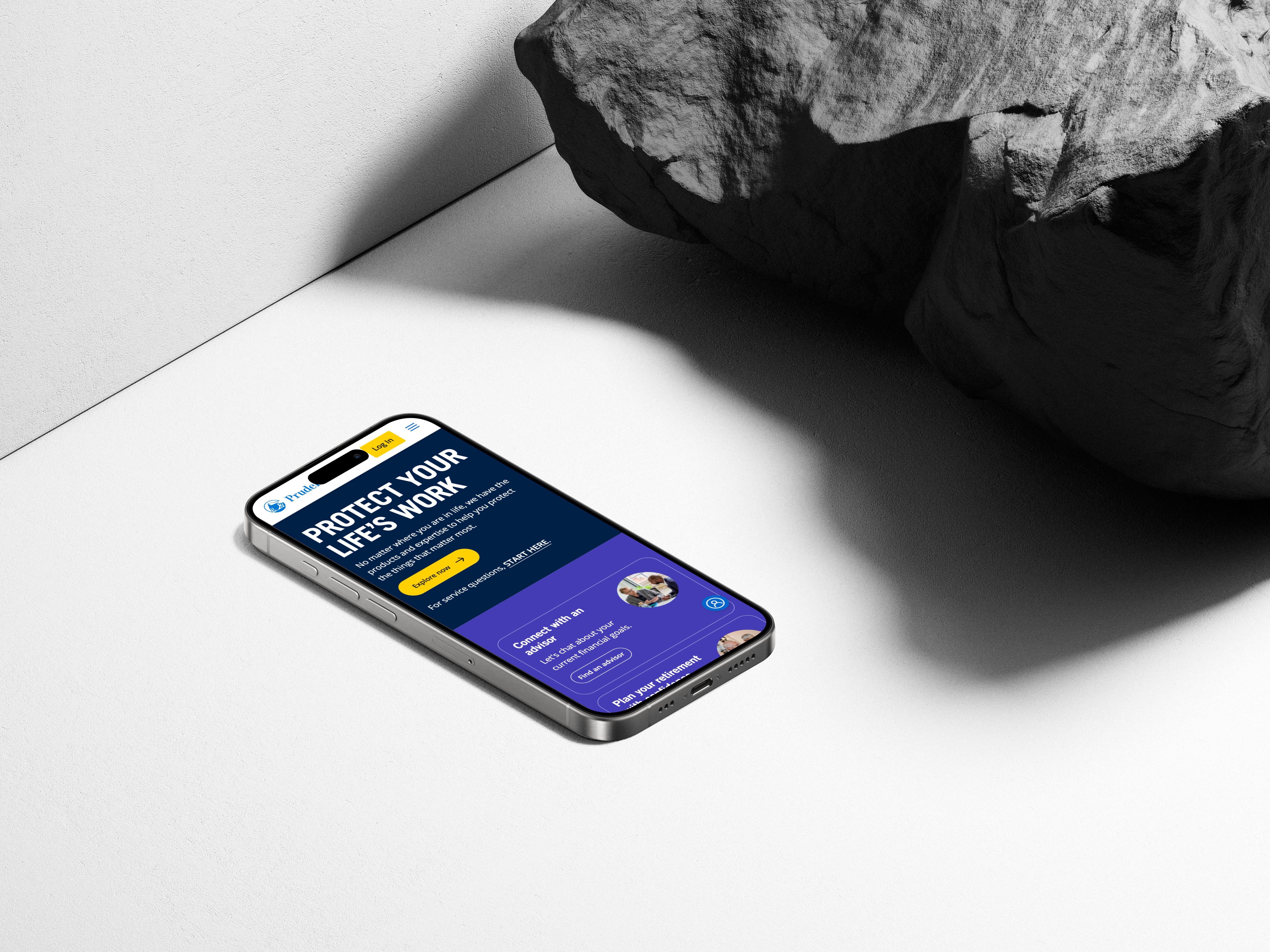
pruxpress is the platform that runs a $44 billion business, and the people who run it were working around it instead of through it. ambiguous requirements, fragmented patterns, and a design system that existed on paper but not in production meant every team was shipping inconsistent experiences. handoff to development was slow because nothing was reusable, and stakeholders were aligning to deliverables instead of to direction.
a strategic redesign that started with the requirements themselves, transforming ambiguity into clear product vision through stakeholder workshops and cross-functional sessions. a design system built for adoption, not just documentation, picked up by 8+ teams across the platform. handoff time to development dropped 40%. the system stopped being an artifact and started being infrastructure.
What does design look like when eight business units share a brand but operate independently?
That was the strategic question underneath this work. PGIM is a top-10 global asset manager with $1.4 trillion in AUM, housing eight specialized business units under a four-year-old common brand. Each manager operated its own marketing site. For institutional users trying to understand the brand and the breadth of products across the enterprise, the result was confusion. Potential leads were further stymied by a lack of clear calls-to-action, leaving isolated content engagement that never aggregated into a reliable client pipeline.
The role spanned product design and design leadership across PruXpress, a $4.5 billion lane of business, and the broader PGIM marketing system that supported seven business sites. The engagement landed during the organization's transition from waterfall to agile, so a significant part of the work was process design — introducing design thinking to teams of product owners, release train engineers, and business analysts who were learning a new methodology while shipping live work. Strengthened relationships between journey management, voice of customer, and content writing partners reframed handoff boundaries that had been ambiguous for years.
The breakthrough came from research. Across business units, market segments, and organizational roles, three user motivations kept surfacing: making fund recommendations, monitoring performance, and getting strategic advice. These motivations cut across the organizational boundaries that had been driving the site architecture. Designing around them, instead of around business unit boundaries, meant the system could be simplified at the structural level while the calls-to-action could be more nuanced and context-specific.
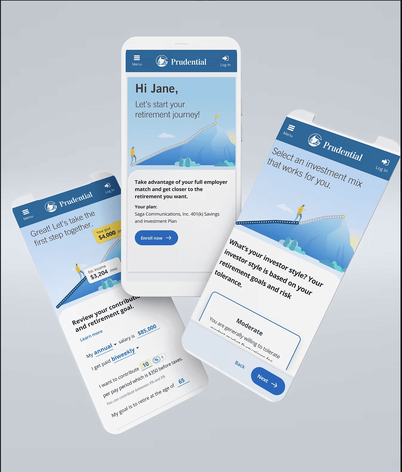
What shipped was a content toolkit that outfitted every piece of content with mechanisms for easy sharing, quick evaluation, and contextual engagement. Each business unit retained the ability to control where and how its content appeared across the ecosystem — preserving the autonomy that mattered to them while removing the user-facing friction that came from eight disconnected experiences. Thought leadership was freed from printer-focused PDFs into formats users could actually scan. Micro-interactions helped users move through dense financial content quickly. Content adapted next steps based on user location and role.
The component system was built in Figma from scratch, with a full audit of the existing production patterns before any new component was made. Stakeholder alignment on branding, identity, and developer feasibility was baked into every component decision. The result was a system adopted across seven UXD teams within Prudential, supporting both the employee-facing and customer-facing sides of the business. Design-to-development handoff time dropped 40%. Mobile-first thinking, previously absent in a predominantly desktop-focused organization, became standard practice for new work.
Three takeaways shaped the work and travel with me into the next engagement like this:
Organizational complexity is a design problem. When eight business units each have their own site, the fix isn't eight better sites. It's a system that respects their autonomy while removing the user-facing cost of their separation. The design move was to find the shared abstraction that didn't force anyone to give up what they actually needed.
User motivations cross organizational boundaries. Designing around what users want to do — not which business unit owns the content they're reading — is what made the simplification possible. Most enterprise sites get this exactly backwards.
Component systems are outcomes of cross-team work, not mandates from above. The system got adopted by seven teams because it solved their actual problems and aligned with how they already worked. Design systems built in isolation and announced to the org rarely survive the first quarter. Systems extracted from real shipped work, with the people who use them, usually do.